Front Porch. Epilogue.
Incase you missed it, here is what we started with on the front porch— circus-orange roof, chopped-into siding, bright purple doors.
Here’s the front porch today.
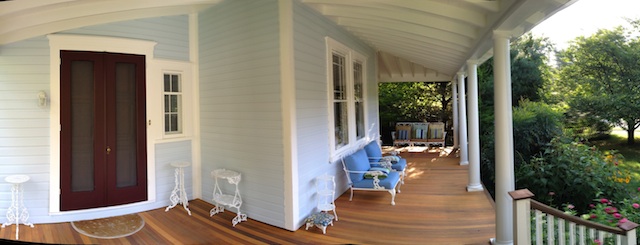
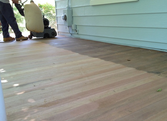
I already covered the floor-stain-debacle in exhaustive detail… you can see how orangey it is. Time and weather will darken the wood, and hopefully, by next spring it will be less… colorful.
Unless it wants to sand itself in the night… In which case, I would appreciate the opportunity to choose a different stain.

These are the porch details I was in charge of:
- Shutter color
- Front door color
- Floor stain for IPE decking
And somehow, despite all the agonizing over shades and tints… Despite all my nine million paint samples… despite testing stains and special-ordering products… I still ended up with a floor color I don’t like.
And a shutter color I don’t like.

I’ll survive. Thanks for your concern.
But mathematically? 1 out of 3? That is a score of 33%.
Kind of like studying really hard for your French exam… for months ahead of time. And conjugating verbs. And reading Sartre. And wanting to reach through time to smack some sense into Simone. And going to France and eating baguettes and saying, Mon Dieu. And OH PIERRE. And wearing some very chic shoes. And traveling out to your country house and making endive salad and wearing only grey. And sounding enchanting even while screaming at your contractor that the cobblestones you ordered for your courtyard were supposed to be marble, not granite. Imbecile!
And then, despite all your hard work… getting an F on the exam anyway. Because the day of, you show up with your pencil, your professor decides not to test you on French. Or your ability to order cobblestones. But instead, on microeconomics.

The problem with the shutters? Is that they look black— A look I find synonymous with actual black.
It’s fine. I mean, except for how I did not want black shutters… And aggravating, because if I was going to choose black shutters, I could have appeared decisive and easygoing… saying airily—oh, just paint them black… I don’t care. La la la.

In my defense, I liked this color on its own. It’s the one on the right, up in the picture. It looked rich and contrast-y and charcoal-y. And it wasn’t until Paul painted all the shutters and hauled them up to the roof that I realized my error.
It was getting dark, and the color didn’t look rich or special anymore, it just looked black. Paul got busy hanging them, and I didn’t have the nerve to tell him I didn’t like it.
Plus, I didn’t need him getting out his laundry list and adding to it–
Item #597: the time Victoria made us repaint the shutters.
Also, I was too tired to care anymore.
He came down from the roof and stood next to me in the driveway. He was like, do you like them? And I was like, yes. They look great. I love them.
If you’re thinking that Paul will read this and be sad when it is revealed to him that I don’t actually like the shutters—let me clarify. Paul will not care if I like them. Only that I am willing to live with them. And he does not have to be further involved.

Paul and I stood there for a moment. Him, appreciating that FINALLY something was getting finished. Me, wishing I had taken more time, found more colors, gotten more samples.
And then Paul said—what kind of paint did you get? And I was like, I don’t know. What do you mean? I got the exterior stuff you told me to.
And he was like, no. I mean what kind of paint did you get?
DID YOU GET GLOSSY PAINT?
And I was like, oh? That? Yes. I totally did.

If you missed how Paul is the glossy-paint patrol, and you feel your life would be enriched by knowing the genesis of the joke, you can read that here.
index of all front porch renovation posts
")
October 17, 2012 @ 10:47 am
For what it is worth, I like the floor stain color and the shutters as well. My wife would love to have a wrap around porch.
October 17, 2012 @ 11:24 am
Thanks! I’ve mostly gotten used to the colors… But, maybe you’re familiar with a wife’s prerogative to hate something randomly, until she decides otherwise?
October 17, 2012 @ 10:59 am
I too noticed the shutters and would have chosen something less black-looking, but I do love the porch floor. In person it might look different, but in the photos it makes a nice contrast to the dark door and sets off the blues nicely.
October 17, 2012 @ 11:25 am
Yes. I tried literally twenty different shades of grey. And I didn’t like any of them. The only thing they accomplished was making the final shade look appealing in comparison… I should have looked ONLY at that color, with no lighter shutter next to it.
I think I’ll like the floor next season. A bit of weathering will make it blend into the background.
October 17, 2012 @ 7:15 pm
There’s a 50 Shades of Grey joke in there somewhere; I’m must be off my game, because I can’t come up with it…
October 18, 2012 @ 9:16 am
The only ones I thought of, weren’t actually funny…
October 17, 2012 @ 11:04 am
The shutters really do look blue when the light is on them, at least in pictures. I don’t think the porch floor looks terrible at all, and not too orangey. Now, my original 1968 oak floors, that’s orange. But I hope you love the porch floor next year. Otherwise I hear now’s a great time to buy clearance outdoor rugs. Also, I laughed out loud at the fisheye lens bit.
October 17, 2012 @ 11:27 am
I hadn’t even considered an outdoor rug, but that would really look nice in the space between the stairs and the front door. Plus, it would dress it up a bit…
Whenever I see fisheye photos in real estate listings, I wonder WHY the realtor thought that was a good look. Just take two photos! I do understand the practicality of the image, but it looks so stupid I can’t get past it.
October 17, 2012 @ 11:57 am
There’s some real estate agent here that takes all their pictures in HDR. Yeah, it’s good sometimes, but not generally in real estate listings. I’m not sure if I’d rather have fish eye listings or HDR; they seem equally bad.
October 17, 2012 @ 3:53 pm
I had to google HDR. And it showed me some really intense/dramatic sample pictures. I laughed at the idea of a bathroom photographed in such a way.
October 17, 2012 @ 11:09 am
Victoria,
I wasn’t sure if, since I followed the second post about the lens, I was supposed to comment on this post or the first…where’s the rule book? 🙂 Like Jeff (above), and at the risk of sounding like I have no taste since I’m not in agreement on the topic, I too like the charcoal shutters and the porch color. Maybe it’s the photo, but it really does look nice. I also like the wide angel images you are able to take with an iPhone. I may have to get an iPhone if it can replace my camera. My point and shoot is aging and I should graduate to a real camera with all the bells and whistles, but simply don’t have time to learn how to use it.
I also like the furniture on the porch…are you planning on putting something on the matching stands that flank the front door, no pressure. You’ll have to post on the story of the furniture on the front porch.
Should I copy and past this comment on the first post? No? Okay, as long as you know I read your hilarious account of the wraparound porch.
Karen
October 17, 2012 @ 3:57 pm
Karen,
I have a “real” camera and pretty much gave it up after I got the iPhone. The iPhone takes fantastic pictures… AND it’s always in my pocket. Sometimes if I really want to crop a picture, I see that it’s not as crisp as it could be, but I’m not a photo purist. And the convenience is unbeatable. (But I’m a total Apple junkie, so you shouldn’t take my opinion as unbiased.)
Obviously you have great taste… so if you say the porch looks nice, I take it as reinforcement that I am just overly critical… as we all are, with our own houses.
I thought about trying to “stage” the porch with mums and pumpkins, but decided the effort was way too much work. 🙂
October 17, 2012 @ 5:07 pm
I love the idea of a dual purpose item such as a camera/phone (two electronic items in one) and since I’ve stubbornly decided I don’t want to take the time to educate myself with a good photography 101 class an iPhone sounds ideal. the little lens is cute but I’m not sure I’d have it with me all the time, which would be the advantage to a phone-camera. Plus, I trust your judgment as far as the lens goes.
Yes, I think from my standpoint and many other readers’ opinions, your porch turned out really beautiful. Your house is so great looking, super curb appeal.
I can see one of those bluish-green pumpkins on your porch. 🙂
Karen
October 18, 2012 @ 9:17 am
I got some of those blue pumpkins last night… great minds!!
October 17, 2012 @ 12:04 pm
I had to go back and read the glossy paint post, and now I want to hug you. (((HUG)))
October 17, 2012 @ 4:00 pm
Lol… thanks. After Paul read that post he was like—but you didn’t TELL people why I don’t want to use glossy paint. And I was like—right, true. I didn’t. BECAUSE IT DOESN’T MATTER.
October 17, 2012 @ 5:47 pm
No kidding! An old fella once told me that his wife said he could vote on decisions, his vote just didn’t count for anything. 😉
October 18, 2012 @ 9:19 am
Lol… Wise words.
October 17, 2012 @ 1:07 pm
I like the way everything looks. That orangey looking porch works well with the pale blue of the house. I understand how frustrating it can be to think you have the right color and then it all looks different once it is applied. But the all-around effect here is quite pretty. Sometimes something slightly ‘off’ keeps it all from being too matchy-matchy and makes the object just that much more interesting.
October 17, 2012 @ 4:17 pm
Thanks! Now that you say about the blue and orange being complementary—some part of my brain thinks those colors are opposite on the color wheel (and therefore approved as a good combination by whomever decides such things).
I actually really like the color orange, so I guess I should claim it was intentional.
October 17, 2012 @ 11:02 pm
But you also managed to avoid looking like a Howard Johnson.
October 18, 2012 @ 9:20 am
It’s the little things in life.
Although, Howard Johnsons is kind of charming… in its own retro, dilapidated way.
October 17, 2012 @ 2:07 pm
Victoria, Victoria, Victoria, I know exactly how it feels to have a picture in your mind about how you want something to come out and then after excruciating hours of research, tests and trials you do it (or get hubby to do it) just to end up with a result that is nothing like you pictured it. I have been down this road MANY times. Sometimes I can not get past the disappointment and when people say it looks nice I don’t believe them. Later I go to change it and realize in fact it actually looked good and, in fact, looked better as the oops than the correction. Some how, some way, you are going to have to look at it with no emotion for a while because I am not alone in thinking that it looks nice. Charcoal and blue look great together. The porch OMG love love love it. Now me? I would have totally destroyed that beautiful wood by painting it charcoal gray or Cream in my coffee beige and then paint rug like designs on it with borders all around and topped it with a thick coat of poly urethane (high gloss of course) and then I would have taken it a step further and painted the porch roof good luck chalk blue and in the end I would have never known what the real beauty of that wood was…LOLOLOL you know I would…I can’t help myself. Seriously…It looks good.
Now on to the iPhone…which I detest. I am digging my Android MyTouch Slide and it has this sweepshot feature on it that is fantastic for capturing a wide photo with no distortion. I will have to do one in a post. I did look it up to see if that feature was available for iPhone and I found
Panorama Camera 360 for iPhone. It costs $2.00. Not sure how it works though…
OH and your yard. OMG beautiful. Next year you have to guide yard dummies like me when and what and how to plant. SErIOUSLY.
October 17, 2012 @ 4:19 pm
I totally drank the Apple kool-aid and am not sure I will ever get out from under the spell of it… although I know people feel just as strongly about their Androids.
The new iPhone has a panoramic feature built in, which I TRIED to tell Paul I REALLY needed. But he did not believe me. I am still under contract for another year and would have to pay crazy money to upgrade early…
I actually think your fancy painted porch sounds pretty good. I do not have the patience you do. Seriously. That kind of intricate detail is something I appreciate in other people’s projects, but cannot stand to do in my own!
I would have loved a haint-blue ceiling. I pretty much have an entire Pinterest board dedicated to them…but obviously it would have been overkill with a blue house.
October 17, 2012 @ 5:34 pm
Actually the iPhone is a really nice phone but I think if people protested having to pay for more memory by changing phones rather that upgrading memory cards it would not have been so bad and I might have drank that koolaid myself. Then this latest trick of changing the power cords and accessories so they are not backward compatible with the earlier phones really turned me off further as that was a really dirty trick. Please don’t get me started.
Yes haint-blue ceilings, I forgot the name and you are right with your color house it probably would be too much.
About the floors I said I would have destroyed that wood. I think what you did is faaaar better than the painted version. I love the way it came out. I am not sure what I love the most about it but the stain color is high on the list. And in case Paul reads your blogs…Paul you rock!!
October 18, 2012 @ 7:56 pm
Paul doesn’t read it unless I ask him. Or plop the computer in front of his face. I’ve asked him—aren’t you CURIOUS what I’m saying???
And he’s pretty much like— I already lived the project. Whatever you have to say about it, I’ve probably already lived through that too. 🙂
October 17, 2012 @ 2:15 pm
I’m still in love with the way the door color and the blue play off of each other. Your gardens look amazing throughout the post too!
October 18, 2012 @ 9:28 am
Thank you! That giant Luna Hibiscus bloomed just about the time we were finishing…
I was surprised the front bed rebounded as well as it did… It spent a good part of the summer covered with plastic or drop cloths or having tools or ladders shoved in it.
October 17, 2012 @ 3:51 pm
Digging the panoramic view in the first pic (and I also kind of like that fish eye at the end – I am such a sucker for round things). But enough about the photos – the porch itself looks GREAT and I LOVE that three-seater in the distance with funky pillows!
I am very into the concept of wood that could sand itself. That’s when I’ll know that we live in a truly civilized society – when objects start taking care of themselves. Bravo!
October 18, 2012 @ 9:27 am
Your retro-loving soul would LOVE the original cushions to that bench/sofa. They’re a brown and orange vinyl, floral print. The lady didn’t have all of them, which was a shame, because they are AWESOME.
Hopefully the self-maintaining house is being studied in a lab somewhere… I will be the first to volunteer for human trials.
October 17, 2012 @ 6:13 pm
Don’t beat me but I really like the porch colour. My parents had the same issue as you. Except they picked out a stain for their “builder” aka the guy that was helping my Dad build their old cabin and when all the wood arrived for the inside of the house (as in wood cabin, all the walls, all the floors, everything…), my mother nearly lost her marbles b/c it wasn’t the colour she wanted. Then I came to visit and was like WOW I love it. Suddenly it wasn’t as bad as she was losing sleep over for months. Go figure b/c she usually doesn’t listen to my opinion at all but that’s a whole other type of blog entry.
Conjugate verbs? I still remember getting a 58% in French class back in Gr 12. I have a certificate from my education system that tells me I am now bilingual. Imbeciles.
I just joined the iPhone insanity after 10 years of being a devoted blackberry user until it pretty much died and I took my friends old iPhone 4. The first time I tried to type on it…is about the same as me typing on it to this day. Though the whole social media/instagram crap is pretty much way better than my old BB. My husband has a Samsung. The camera on it blows mine out of the water. But it’s even worse to type on than the iPhone.
October 18, 2012 @ 9:30 am
You need to upgrade. It. Is. Necessary.
The 4s and up have voice recognition. I haven’t typed a text or an email or a note or a reminder since I got the 4s. NOT TYPING RULES. And makes me look like a text-ninja.
I love my iPhone so much I really want to upgrade to the 5 before my contract is up. I need to read reviews on the difference in the camera before I decide. The 4s got a newly-designed camera, so it might still be the same in the 5… in which case, I’m not sure it’s justified.
p.s.- I am only bilingual if you count waving your hands in the air and pointing dramatically.
October 17, 2012 @ 8:59 pm
I’m impressed you managed to slip in a mention of Sartre in a post about your front porch and shutters. What are you… some kind of linguistic, home renovation savant?
As for the look of the house… I think it’s beautiful. As you know, we live in a historic district. Restoration projects are closely watched by a special preservation commission. These people spent several months (and killed a thousand trees) producing an informational packet about the quality and accuracy of our reproduction window sashes prior to a vote on how/when/at what cost we’d be allowed to replace our home’s cracked panes. This nearly killed me.
But having lived here several years… I think I’ve developed an eye for how a fine restoration should look. I also know a bit about historical paints and authentic color choices. I also live in a white house with blue trim and black shutters. Which has absolutely no bearing on my comments here. Well… maybe a little.
Anyway… I think you and Paul have done a fabulous job. It’s utterly gorgeous and I’m impressed at your mad skills. I’m not joking when I tell you that about two hours ago I was proud of my husband and myself for successfully repairing a broken doorstop without argument or injury.
Now I’m going to read the gloss post.
October 18, 2012 @ 10:09 am
I laughed out loud. LOUDLY… I may well be some type of savant. An undiscovered kind. With no math or poker or other useful skills.
We have a historical commission, but ours only has the power of harassment, not enforcement… So we were merrily able to replace windows rather than rebuilding them in their preferred method of spending huge amounts of money.
We did the best we could as far as similarity… but if you go on a historic renovation chat board, you can see all kinds of people just like me, getting flamed for suggesting they are going to replace their old windows.
Working together, as a team to replace a doorstop? Without death or other unpleasant side effects is a goal I hope to someday achieve.
p.s.- you seem like someone who’s as entertained by the “binders full of women” meme as I am… in which case, I wouldn’t want you to miss this tumblr: http://bindersfullofwomen.tumblr.com/
October 18, 2012 @ 10:39 am
Loved that!!! Thank you so much for the link… better even than “The Daily Show”… still laughing!!!!
October 18, 2012 @ 10:41 am
LOL!! I’m so glad… my favorites were the ones of Hilary texting.
October 18, 2012 @ 4:27 pm
okay, I know I’m easy to please, but OMG I LOVE IT. I love the contrast between the shutters and the blue of the house and I LOVE the color of the stain. (But, I loved it when you first posted it and hated it, too. ha) I’m sorry you aren’t head over heels in love with it….yet. But you might be. And rock on for getting the glossy glossy ! Another beautiful job well done.
October 18, 2012 @ 7:54 pm
You’re too funny. I *will* rock on with my glossy paint!!
I DO actually really like the blue of the house… I’ve just realized that for all my complaining, I never got around to the things I do like. Guess I need to work on my positive outlook…
October 18, 2012 @ 8:07 pm
Loving it!! It looks gorgeous! I would be sitting out there all day, reading a book with a granny blanket over my knees. It looks sooo inviting. Also, i really like your shutters as they tone in well with the roof.
October 19, 2012 @ 7:22 am
Thank you! Yes, I love sitting out there and reading. When I’m out there, I can see that I really should be deadheading my flowers or ripping out the dead stuff… but I’m not at all motivated to get up and do it!
October 20, 2012 @ 7:26 pm
I have to say that I agree with you about the shutter color. Although on a paint chip it probably doesn’t look black, once used though, it really does look like black or even…sorry about this, sun-faded black plastic…which if you should ever press the point about repainting them, might be a good arguement in favor of repainting.
Here in Tidewater Virginia there are dozens of suburban neighborhoods around with way too many houses that have plastic shutters. Although the manufacturers would say they aren’t truly made out of “plastic,” they definitely aren’t made out of wood.
If you ever felt like you really need to get those shutters repainted, that might be the angle to take…”They look like they were made out of plastic, sun-faded black plastic.” For me, this trumps every other criticism I could ever get. If something looks like its been made out of plastic that just totally wipes out all of the hours that I’ve spent doing something. Looking like plastic is the absolute last thing I ever want to do. I’d even settle for “amateurish” before “plastic-like.”
Still “FINISHED” is an awfully good feeling!
October 21, 2012 @ 12:02 pm
Taking notes. Scribble… scribble… scribble.
Although I like to think my husband will hop-to when I suggest repainting them… it is WAY more likely I will have to tell him the sad, sad news that I chose the only color worse than black…
In my defense, you know I TRIED other colors. Why did NONE of them look good? Why? Why? Why?
October 21, 2012 @ 12:49 pm
“Why?” What a great question.
The first painting that I ever did was the bedroom of the first apartment that I ever had. I chose what I thought was a really great color. It looked great on the color chip in the paint store, and I had seen a similar color in a magazine. I was sure that this was the one! I started painting and it didn’t look quite right. Maybe it was that it just needed to dry. Didn’t all of the “how-to” magazines say something about things looking better when they dried? So I just painted away.
Once it was all dry, it really didn’t look better. It actually looked worse. The color ended up looking like the inside of a pumpkin. I spent the night somewhere else. Who could have slept inside a pumpkin?!? The next day I settled for a safe beige color. Lesson learned!
Actually the color of the shutters for you is what you might call a safe color. Not necessarily the great designer-inspired color (like what I was going for), but sometimes safe is good.
October 22, 2012 @ 10:52 am
Laughing out loud at the pumpkin interior design. Bold colors look so great on those chips… but kind of lurid in person.
Since this post has been up for awhile, it’s probably safe to admit this to you without too many people reading down into the comments this far:
The sample paint we used to make our decision on the shutters was flat… and I think the gloss is at least part of the problem. 1- it makes it darker. 2- it makes it plastic-ier… Yet another thing I can never tell Paul.
March 20, 2013 @ 4:29 pm
Oh, your gardening looks lovely!
I’ve been perusing your blog all afternoon -all the while neglecting some other duties…. but I’m categorizing my reading time as “needed inspiration.” I love your written voice, and your humor, and word use! Thanks for a good afternoon! 😉
–The kitchen designer who also works part-time in the Ace Hardware garden section. So that’s why I KNOW your yard looks good. And your house.
March 20, 2013 @ 8:08 pm
Hey! You really, really, totally made my day… thank you!!
I sometimes worry that I am using SO many words, no one actually reads them… I once read that the average time someone spends on a webpage is less than five minutes… you can see that no one could possibly appreciate ALL I have to say in such a short time.
The flowers cover a multitude of sins with the crummy old lattice… and incase you were wondering, the porch is STILL orange. Vividly so.
July 31, 2013 @ 2:00 pm
Love the house, the blog, your sense of humor, and your style–classy.
August 2, 2013 @ 5:57 am
They don’t look black to me. I can see they are not black. If that helps.
August 15, 2013 @ 3:40 pm
Victoria, your house looks beautiful! I love the landscaping and how overgrown it looks (that’s intentional, right? Or are you just a really lazy gardener?)
I don’t understand what’s so bad about the black shutters. I’m a huge black and white person. Once I almost painted my bedroom black and then realized that was a really terrible idea, so I’m planning on a grayish color now.
Hah! I love the Pinterest references. I need a Karl lagerfeld board now.
I really want to be consoling about your front porch, but the truth is I hate orange and would replace all of the orange in the world with beige if I could. (I’m a big neutrals fan. Can you tell?) I’m not saying it’s ugly, but it just has a pumpkin tone to it. You understand.
October 21, 2013 @ 4:07 pm
I pretty much read your whole post on the porch project. I was laughing so hard I was crying… at work… mind you… while googling different stain products for our fence. The dynamics of husband and wife -perspectives, decision-making, compromising (or not)- it was so entertaining for a mid-afternoon break and laugh. I love your inner dialogue… I can so relate. Love the custom door color with your plastic spoon concoction sample and then making your husband go to the store and replicate… that was AWESOME!
Thank you for lightening up my task! 🙂
January 22, 2014 @ 1:52 pm
Love your blog! I was disappointed that you removed the porch railing as they tied the round columns to the square stair railings. Those stairs stick out like a sore thumb! I have seen some WONDERFUL square columns that have 1/3 field stone covered on the bottom! Course that would be another project! Instead of replacing the columns your husband could cover them so they would be square! and about 1/3 way up put molding around them and fill that bottom space with lovely field stone! I think it would add more heaviness to the columns that look way to light being round. Your lines are all square and the columns scream square!!! keep up the great work. That is wonderful thing about home ownership…it is ALWAYS a work in progress!